2020. 11. 12. 17:19ㆍ재주껏 하는 Front-End/Svelte (준비중)
이번에는 Svelte에서 제공하는 내장 요소들에 대해 알아보자.
<svelte:self>
특정 컴포넌트 내부에서 컴포넌트 자신을 재귀로 추가해야 하는 경우에 사용한다. 재귀로 컴포넌트 자신을 추가해야 하는 경우 일반적으로 <script> 태그 내에서 컴포넌트를 import 하여 사용하지만, Svelte에서는 <svelte:self> 요소를 사용하여 쉽게 구현할 수 있다.
아래의 예제는 폴더와 파일 구조를 트리로 출력하는 컴포넌트의 예제이다. 폴더 내부에 파일이 여러 개 들어가기 때문에 재귀 형태로 나타내야만 한다.
1) App.svelte
<script>
	import Folder from './Folder.svelte';

	let root = [
		{
			type: 'folder',
			name: 'Important work stuff',
			files: [
				{ type: 'file', name: 'quarterly-results.xlsx' }
			]
		},
		{
			type: 'folder',
			name: 'Animal GIFs',
			files: [
				{
					type: 'folder',
					name: 'Dogs',
					files: [
						{ type: 'file', name: 'treadmill.gif' },
						{ type: 'file', name: 'rope-jumping.gif' }
					]
				},
				{
					type: 'folder',
					name: 'Goats',
					files: [
						{ type: 'file', name: 'parkour.gif' },
						{ type: 'file', name: 'rampage.gif' }
					]
				},
				{ type: 'file', name: 'cat-roomba.gif' },
				{ type: 'file', name: 'duck-shuffle.gif' },
				{ type: 'file', name: 'monkey-on-a-pig.gif' }
			]
		},
		{ type: 'file', name: 'TODO.md' }
	];
</script>

<Folder name="Home" files={root} expanded/>
2) File.svelte
<script>
	export let name;
	$: type = name.slice(name.lastIndexOf('.') + 1);
</script>

<style>
	span {
		padding: 0 0 0 1.5em;
		background: 0 0.1em no-repeat;
		background-size: 1em 1em;
	}
</style>

<span style="background-image: url(tutorial/icons/{type}.svg)">{name}</span>
3) Folder.svelte
<script>
	import File from './File.svelte';

	export let expanded = false;
	export let name;
	export let files;

	function toggle() {
		expanded = !expanded;
	}
</script>

<style>
	span {
		padding: 0 0 0 1.5em;
		background: url(tutorial/icons/folder.svg) 0 0.1em no-repeat;
		background-size: 1em 1em;
		font-weight: bold;
		cursor: pointer;
	}

	.expanded {
		background-image: url(tutorial/icons/folder-open.svg);
	}

	ul {
		padding: 0.2em 0 0 0.5em;
		margin: 0 0 0 0.5em;
		list-style: none;
		border-left: 1px solid #eee;
	}

	li {
		padding: 0.2em 0;
	}
</style>

<span class:expanded on:click={toggle}>{name}</span>

{#if expanded}
	<ul>
		{#each files as file}
			<li>
				{#if file.type === 'folder'}
					<svelte:self {...file}/>
				{:else}
					<File {...file}/>
				{/if}
			</li>
		{/each}
	</ul>
{/if}
Folder 컴포넌트를 보면 전달된 타입이 'folder'일 경우 <svelte:self>를 사용해서 Folder 컴포넌트 자신을 재귀로 추가하는 것을 확인할 수 있다. 아래는 예제를 실행한 스크린 샷이다.

<svelte:component>
조건에 따라 DOM에 마운트 되어야 하는 컴포넌트를 달리 해야 하는 경우에 사용한다. 즉, 동적 컴포넌트를 만들 때 사용하는 것으로 Props로 this를 제공하며, this에는 마운트 할 컴포넌트 객체를 전달한다. 아래의 예제는 Select Box에서 선택한 컴포넌트가 동적으로 DOM에 마운트 되는 예제이다.
1) App.svelte
<script>
	import RedThing from './RedThing.svelte';
	import GreenThing from './GreenThing.svelte';
	import BlueThing from './BlueThing.svelte';

	const options = [
		{ color: 'red',   component: RedThing   },
		{ color: 'green', component: GreenThing },
		{ color: 'blue',  component: BlueThing  },
	];

	let selected = options[0];
</script>

<select bind:value={selected}>
	{#each options as option}
		<option value={option}>{option.color}</option>
	{/each}
</select>

<svelte:component this={selected.component}/>
2) RedThing
<style>
	strong { color: red; }
</style>

<strong>red thing</strong>
3) GreenThing
<style>
	strong { color: green; }
</style>

<strong>green thing</strong>
4) BlueThing
<style>
	strong { color: blue; }
</style>

<strong>blue thing</strong>
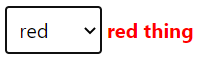
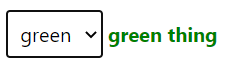
<svelte:component>를 사용하지 않는다면 if / else 블록으로 모든 컴포넌트를 조건에 따른 분기 처리를 해야만 한다. 이 요소는 개발 시 매우 자주 사용될 것이기 때문에 알아두는 것이 좋다. 아래는 예제 코드를 실행한 결과다.

<svelte:window>
브라우저 최상위 객체인 window를 가리키는 요소로 전역 이벤트를 설정할 때 편리하게 사용할 수 있다. 예를 들어, 브라우저의 리사이즈 이벤트를 받아야 된다고 가정해보자. Svelte가 아닌 프레임 워크 또는 JS 환경에서는 아래와 같은 코드로 전역 이벤트를 설정한다.
window.addEventListener('resize', function () { ... })
Svelte에서는 아래의 코드로 전역 이벤트를 설정한다.
<svelte:window on:resize={ () => {...} } />
두 코드가 별 차이 없는 것 같지만 Svelte가 아닌 경우, 페이지가 닫히거나 이동될 때 메모리 누수 방지를 위해 아래의 코드로 이벤트 리스너를 제거해야만 한다.
window.removeEventListener('resize', function () { ... })
하지만 <svelte:window>를 사용하면 메모리 누수를 신경 쓸 필요가 없어 편리하다.
<svelte:window> Bindings
<svelte:window>는 전역 이벤트 연결 외에도 아래의 전역 멤버 값을 쉽게 바인딩할 수 있다.
| 요소 | 설명 |
| innerWidth | 브라우저 Content 너비 |
| innerHeight | 브라우저 Content 높이 |
| outerWidth | 브라우저 Full Size 너비 |
| outerHeight | 브라우저 Full Size 높이 |
| scrollX | 브라우저 Content 가로 스크롤 픽셀값 |
| scrollY | 브라우저 Content 세로 스크롤 픽셀값 |
| online | 브라우저의 네트워크 연결 상태를 Boolean으로 리턴 |
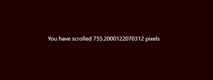
scrollX와 scrollY를 제외한 모든 값은 읽기 전용이기 때문에 값을 변경할 수 없다. 아래의 예제는 스크롤을 내리면 Y축 스크롤이 얼마나 되었는지를 출력하는 예제이다.
<script>
	const layers = [0, 1, 2, 3, 4, 5, 6, 7, 8];

	let y;
</script>

<svelte:window bind:scrollY={y}/>

<a class="parallax-container" href="https://www.firewatchgame.com">
	{#each layers as layer}
		<img
			style="transform: translate(0,{-y * layer / (layers.length - 1)}px)"
			src="https://www.firewatchgame.com/images/parallax/parallax{layer}.png"
			alt="parallax layer {layer}"
		>
	{/each}
</a>

<div class="text">
	<span style="opacity: {1 - Math.max(0, y / 40)}">
		scroll down
	</span>

	<div class="foreground">
		You have scrolled {y} pixels
	</div>
</div>

<style>
	.parallax-container {
		position: fixed;
		width: 2400px;
		height: 712px;
		left: 50%;
		transform: translate(-50%,0);
	}

	.parallax-container img {
		position: absolute;
		top: 0;
		left: 0;
		width: 100%;
		will-change: transform;
	}

	.parallax-container img:last-child::after {
		content: '';
		position: absolute;
		width: 100%;
		height: 100%;
		background: rgb(45,10,13);
	}

	.text {
		position: relative;
		width: 100%;
		height: 300vh;
		color: rgb(220,113,43);
		text-align: center;
		padding: 4em 0.5em 0.5em 0.5em;
		box-sizing: border-box;
		pointer-events: none;
	}

	span {
		display: block;
		font-size: 1em;
		text-transform: uppercase;
		will-change: transform, opacity;
	}

	.foreground {
		position: absolute;
		top: 711px;
		left: 0;
		width: 100%;
		height: calc(100% - 712px);
		background-color: rgb(32,0,1);
		color: white;
		padding: 50vh 0 0 0;
	}

	:global(body) {
		margin: 0;
		padding: 0;
		background-color: rgb(253, 174, 51);
	}
</style>
실행 결과는 아래와 같다.
<svelte:body>
<svelte:window>와 마찬가지로 <body>를 가리키는 특수한 요소다. <svelte:window>와 사용 방법이 크게 다르지 않으며 window에서 사용할 수 없는 이벤트인 mouseenter와 mouseleave 이벤트를 연결할 수 있다.
<svelte:body
	on:mouseenter={handleMouseenter}
	on:mouseleave={handleMouseleave}
/>
<svelte:head>
HTML 문서의 <head> 부분을 동적으로 컨트롤할 수 있는 특수 요소로 <svelte:head> 사이에 <head> 태그에 들어갈 수 있는 태그와 설정들을 넣어주면 된다. 기본적인 사용 방법은 아래와 같다.
<svelte:head>
<title> Svelte Special Elements </title>
<link rel="stylesheet" herf="...">
...
</svelte:head>
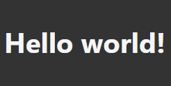
아래는 페이지의 배경을 어둡게 하는 테마를 적용하는 간단한 예제 코드이다.
<svelte:head>
	<link rel="stylesheet" href="tutorial/dark-theme.css">
</svelte:head>

<h1>Hello world!</h1>
실행 결과는 아래와 같다.
<svelte:options>
Svelte 컴파일러의 옵션을 정의한다. 아래는 <svelte:options>에서 제공하는 옵션들이다.
| 옵션 | 설명 |
| immutable={true} | 변하지 않는 데이터를 사용할 것이라고 컴파일러에게 알려 간단한 참조 검사를 진행하는 옵션 |
| immutable={false} | 기본값으로 엄격하게 값이 변경 되었는지를 체크하는 옵션 |
| accessors={true} | 컴포넌트의 Props에 Getter와 Setter를 추가 |
| accessors={false} | 기본값으로 Props는 온전히 전달의 역할만 수행함 |
| namespace: "..." | 컴포넌트의 네임 스페이스를 지정하는 것으로 <svg>에서 사용함 |
| tag="..." | 사용자 지정 컴포넌트로 컴파일 할 때 컴포넌트의 이름 |
이 중에서 immutable 속성의 예제를 살펴보자. 아래의 예제는 Todo 리스트에서 항목을 클릭하면 주변이 반짝 거리는 플래시 효과가 나타나는 예제이다.
1) App.svelte
<script>
	import Todo from './Todo.svelte';

	let todos = [
		{ id: 1, done: true, text: 'wash the car' },
		{ id: 2, done: false, text: 'take the dog for a walk' },
		{ id: 3, done: false, text: 'mow the lawn' }
	];

	function toggle(toggled) {
		todos = todos.map(todo => {
			if (todo === toggled) {
				// return a new object
				return {
					id: todo.id,
					text: todo.text,
					done: !todo.done
				};
			}

			// return the same object
			return todo;
		});
	}
</script>

<h2>Todos</h2>
{#each todos as todo}
	<Todo {todo} on:click={() => toggle(todo)}/>
{/each}
2) Todo.svelte
<svelte:options immutable={true}/>

<script>
	import { afterUpdate } from 'svelte';
	import flash from './flash.js';

	export let todo;

	let div;

	afterUpdate(() => {
		flash(div);
	});
</script>

<style>
	div {
		cursor: pointer;
		line-height: 1.5;
	}
</style>

<!-- the text will flash red whenever
     the `todo` object changes -->
<div bind:this={div} on:click>
	{todo.done ? '👍': ''} {todo.text}
</div>
3) Flash.js
export default function flash(element) {
	requestAnimationFrame(() => {
		element.style.transition = 'none';
		element.style.color = 'rgba(255,62,0,1)';
		element.style.backgroundColor = 'rgba(255,62,0,0.2)';

		setTimeout(() => {
			element.style.transition = 'color 1s, background 1s';
			element.style.color = '';
			element.style.backgroundColor = '';
		});
	});
}
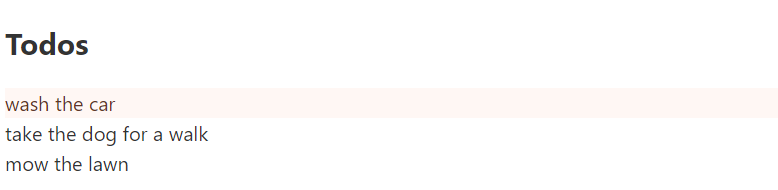
Todo 컴포넌트를 보면 상단에 immutable 속성이 적용되어 있음을 볼 수 있다. 이 옵션이 적용된 상태에서 항목을 클릭하면 아래와 같이 출력된다.
이번에는 Todo 컴포넌트 상단의 <svelte:options>를 제거하고 다시 한번 클릭해보자.
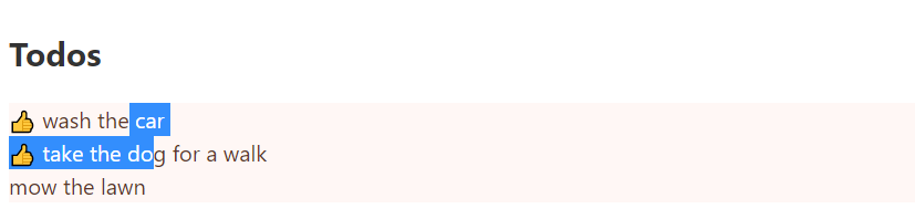
Svelte의 immutable 옵션을 true로 설정하면 상태가 변경된 항목만 검사하기 때문에 클릭한 Todo 항목만 효과가 적용된다. 반면에, immutable 옵션을 false로 한 경우 (기본값) 에는 하나의 항목이 변경되더라도 전체를 모두 검사하기 때문에 모든 Todo 항목에 효과가 적용된다.
컴파일러가 체크하는 항목이 줄어들기 때문에 성능상으로 이점이 있을 것 같은데 공식 API 문서에는 이러한 내용은 언급된 게 없어서 실제로 좋은지는 모르겠다.
오늘은 여기까지이며 다음에는 Context API에 대해 알아보도록 하겠다.
'재주껏 하는 Front-End > Svelte (준비중)' 카테고리의 다른 글
| 13. Module Context, Debug (0) | 2020.11.27 |
|---|---|
| 12. Context API (2) | 2020.11.24 |
| 10. Slot (0) | 2020.10.29 |
| 9. 스토어 (0) | 2020.10.07 |
| 8. 컴포넌트 생명 주기 (0) | 2020.09.22 |